

The Cover: This began as a photocopy collage of images that had been used in the artwork from previous Acts Of Sedition releases. In the style of Black Sabbath's Live Evil, and Rush's Exit... Stage Left, I wanted to do what was basically a class reunion of the characters from previous releases and songs. I had already drawn the portrait of little boy Bush for the Acts Of Sedition/Separations Winter Tour 2009 poster, a jaunt which Acts was forced to drop out of due to a nasty case of bacterial pneumonia. The little yellow boy scouts are from the Sick Lead The Blind 7" cover. The cop cars are from the Crown Victoria EP. The evil priests are from the booklet of the Bafabegiya split twelve inch, and the buildings are from the cover of the Sadville split 7". Collect em all! After I made the collage of photocopied images, I hand colored the whole thing with water color. I put the text in later on the computer, after distressing it by hand. The Acts Of Sedition wordmark gets the neon green treatment because I wanted to suggest the toxic thrash metal/crossover aesthetic of the late 80's.
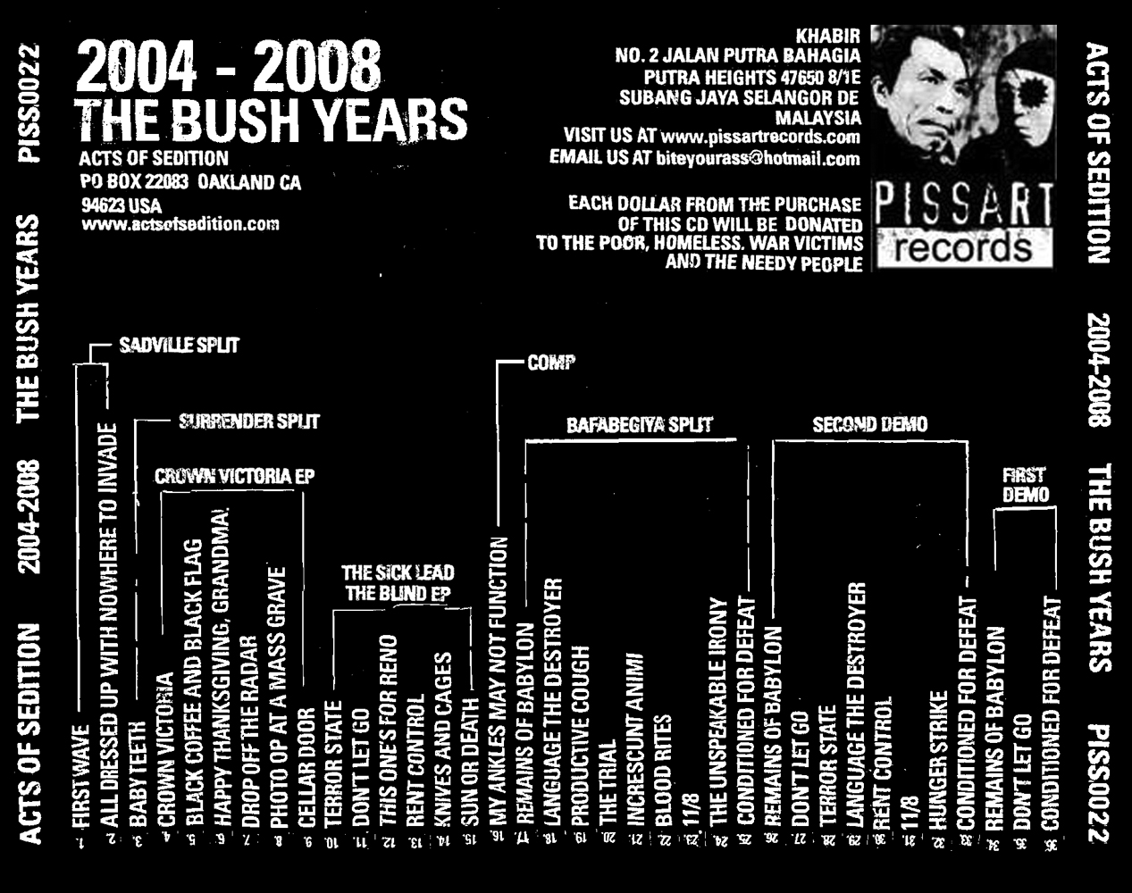
The Back Cover: The text on the back cover is all a condensed bold form of the Univers type face. While originally composed on the computer, I printed out all the text and distressed it by hand to make it look more punk. There is no text in the entire layout of this CD that came directly from a computer without first being printed out and fucked up in some way. Techniques include shrinking and increasing pages in a copy machine, crumpling and resmoothing pages by hand, etc. My favorite thing about the back cover however is the activation of a two dimensional plane into a tactile object. The songs titles, numbers, and their original release platform is all included in the information on the back, but you have to rotate the CD 270 degrees in your hands to read it all. A flat surface becomes something interactive! (or annoying!)

Outside Booklet: I got to spread the inside layout over four pages, which is quite a luxury for a CD booklet in the world of DIY punk. We had to specially commission a live photograph of the band that had all four members in it, because if any existed at the time, it was not possible to locate them. I'm stoked on the one we got. My only disappointment in the whole package is the center photo of the releases and flyers. I took that picture, and I have to say it doesn't look great, but it was the only way I could think of to solve the problem, and I was running out of time.

Inside Booklet: The sheer amount of lyrics and information that has to go into a 36 song discography CD is a little staggering, but I was determined to have every word and bit of relevant matter in the booklet. In order to keep the punk aesthetic going, I used the distressed Univers type from the rest of the layout on the song titles, and hammered out all the rest of the text on my beater ass old type writer! And if that wasn't enough work, I then scanned the typewriter text, and painstakingly rearranged it all into the neat columns you see here. A pillar of my personal design ethos: apparent chaos ruled by underlying order. I also love the abstract form of the typewriter text when seen from distance.

The Poster: The guy at the record label in Malaysia also asked me to do a full size poster to promote the CD. I was stoked to design a big poster, and get the chance to reveal some more of my original painting, which included some cool vikings and guillotines. Alas, the label ran out of money, and the poster was never printed. Here is the only place you'll ever see it. Too bad, it would've looked pretty bad ass hanging on your wall, huh?
I bought this a few months ago from your Piss Art and it is a pretty sweet package. I originally turned on to a.o.s. through the demo mail order section in the back of MRR. I thought that disc was great so I jumped at the chance to get the complete discography. Good Job!
ReplyDelete